In this tutorial we will create a simple CSS animation of the appearance of the text. Let’s break our text into separate phrases and scroll them one after another, like slides. This technique can often be seen in the header of a website or on a banner.
HTML code
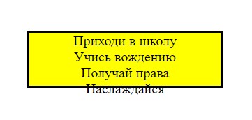
Let’s create a parent container for text boxes. All text blocks will be absolutely the same in form, but different in content.
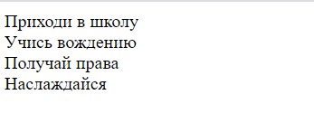
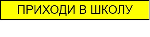
Приходи в школу
Учись вождению
Получай права
Наслаждайся
CSS code
In order for our container to be placed in the center of the screen, apply to the tag body flex and style the container itself.
body {
    display: flex;
    align-items: center;
    justify-content: center;
    height: 25vh;
}
.container {
text-align: center;
height: 60px;
background: yellow;
border: 3px solid black;
padding: 0 50px; /* отступы по краям */
}
Next, let’s style the block with the text.
.text {
    font-family: Arial, Helvetica, sans-serif;
    font-size: 40px;
    line-height: 60px; /* равен высоте контейнера */
    text-transform: uppercase;
}
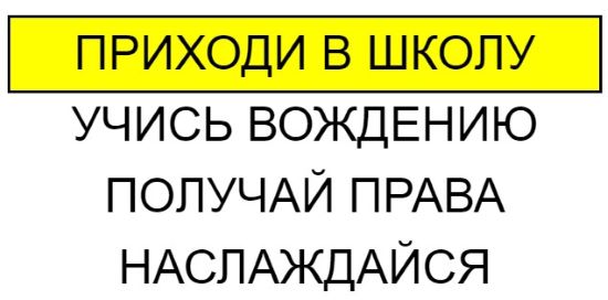
We want the block with the text to change in turn in the yellow container, and hide everything outside the container. To do this, add one important property to the container, overflow: hidden.
.container {
    ...
    overflow: hidden;
}
Now only the first block with the text remains visible.
CSS Animation
Create 7 frames keyframes from 0% to 100% in approximately 16% steps. We get such a number as a result of dividing 100/6. Where did these 7 frames come from? We have four test lines to run back and forth. Since the first line will appear in the first frame by default, the total number of frames is calculated using the formula 8-1 = 7. As we move up, we will increase in importance margin-top by 60 pixels, and when moving down, shrink it by 60 pixels.
@keyframes slide {
    0% {
        margin-top: 0;
    }
    16% {
        margin-top: -60px;
    }
    33% {
        margin-top: -120px;
    }
    50% {
        margin-top: -180px;
    }
    66% {
        margin-top: -120px;
    }
    82% {
        margin-top: -60px;
    }
    100% {
        margin-top: 0;
    }
}
Let’s give an arbitrary name to the animation slide, we will indicate the duration of the animation and set to infinity infinite… Let’s animate the first block with text, which will drag the other three blocks. When the first block goes up outside the yellow container, it will hide, thanks to the property overflow: hidden… The first line will be replaced by another, and so on in a circle.
.text:first-child {
    animation: slide 12s infinite;
}
Take a look at an example at CodePen
Previous article Next article
Copying of materials is allowed only with the indication of the author (Mikhail Rusakov) and an indexed direct link to the site (http://myrusakov.ru)!
Add to my friends VK: http://vk.com/myrusakov.
If you want to rate me and my work, then write it in my group: http://vk.com/rusakovmy.
If you do not want to miss new materials on the site,
then you can subscribe to updates: Subscribe to updates
If you still have any questions, or you have a desire to comment on this article, then you can leave your comment at the bottom of the page.
If you liked the site, then post a link to it (on your site, on the forum, in contact):
-
Button:
It looks like this:

-
Text link:
It looks like this: How to create your website
- BB-code of the link for forums (for example, you can put it in the signature):