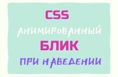
Different hover Effects on buttons serve to grab the attention of users in order to induce them to take action. Today we will look at how to create an animated flare on hover over a button.
Button position on the screen
As always, let’s start by creating a container, where we will place our button. Please note that I am not using the tag button, and immediately register the link with the class button… In order to avoid unnecessary code (button + link) in HTML markup.
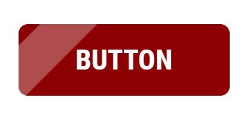
Button
By default, the button is pressed to the upper left corner of the browser, to position it in the center of the screen, set the following CSS properties to the container.
.container {
    width: 100%; /* ширина на всю ширину браузера */
    height: 100vh; /* на всю высоту первого экрана */
    display: flex; /* делаем контейнер гибким */
    justify-content: center; /* по центру по горизонтали */
    align-items: center; /* вертикальное центрирование */
}
Button creation
Now using CSS styles, let’s create the button itself. We used an inline element to mark up the button. a and to be able to apply block-level CSS properties (indents, frames), we will display the button as an inline-block element.
button{
    display: inline-block;/* отображать как строчно-блочный элемент*/
    text-decoration: none;/* убираем дефолтное подчеркивание у ссылки*/
    font-family: 'Roboto Condensed';/*название шрифта*/
    text-transform: uppercase;/*трансформация в заглавные буквы */
    font-weight: 900;/*толщина шрифта*/
    color: #fff;/*цвет текста на кнопке*/
    font-size: 30px;/*размер шрифта*/
    background-color: darkred;/* цвет кнопки */
    padding: 20px 60px;/* расстояние от текста до края кнопки */
    position: relative;/* относительное позиционирование */
    border-radius: 10px;/* радиус скругления углов*/
    overflow: hidden;/* спрятать все лишнее за пределами кнопки*/
}
Flare CSS styling
To create a highlight, you do not need to create a new element, but use the pseudo-element before… Let’s overlay a semi-transparent pseudo-button on top with a width one third smaller than the original button.
button:before {
    content: ""; /* отображает псевдоэлемент */
    position: absolute; /* абсолютное позиционирование */
    top: 0; /* верхняя координата */
    left: 0; /* левая координата */
    width: 2em; /* относительная ширина */
    height: 100%; /* высота как у оригинала */
    background-color: rgba(255, 255, 255, 0.3); /* белый цвет с полупрозрачностью */
}

The lens flare has been created and now needs to be rotated diagonally. The properties are responsible for this: transform: skew… Rotate the highlight by -45 degrees.
transform: translateX(-0.5em) skewX(-45deg);
If we want the flare to appear on hover, then initially we need to hide it by changing the value of y translateX.
transform: translateX(-4em) skewX(-45deg);
Flare animation
Animation is created using a keyword @keyframes… Let’s come up with a name for the animation, let it be moveLight… To move the flare over the button from one point to another (from … to), it is enough to create two frames with different values of y translateX… And the last thing is to hang the created animation on the pseudo-element before with an indication of the speed of the animation. The lower the number, the faster the highlight will flicker. When you hover over the button, the flare will slide along the entire length of the button.
.button:hover:before {
    animation: moveLight 0.5s;
}
@keyframes moveLight {
from {
transform: translateX(-4em) skewX(-45deg);
}
to {
transform: translateX(10em) skewX(-45deg);
}
}
Take a look at an example at CodePen
Previous article Next article
Copying of materials is allowed only with the indication of the author (Mikhail Rusakov) and an indexed direct link to the site (http://myrusakov.ru)!
Add to my friends VK: http://vk.com/myrusakov.
If you want to rate me and my work, then write it in my group: http://vk.com/rusakovmy.
If you do not want to miss new materials on the site,
then you can subscribe to updates: Subscribe to updates
If you still have any questions, or you have a desire to comment on this article, then you can leave your comment at the bottom of the page.
If you liked the site, then post a link to it (on your site, on the forum, in contact):
-
Button:
It looks like this:

-
Text link:
It looks like this: How to create your website
- BB-code of the link for forums (for example, you can put it in the signature):